White Space and Clean Design
The Minimalists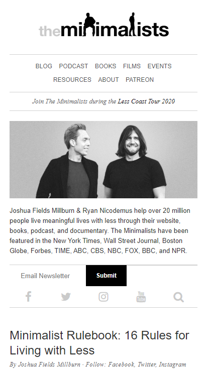
From the homepage of the Minimalists, you can see that they put great focus into white space, only putting on the site what they believe to be necessary. They show very little other than the content, giving the site a fresh, clean look especially without having advertisements anywhere.
Visual Hierarchy
LA Zoo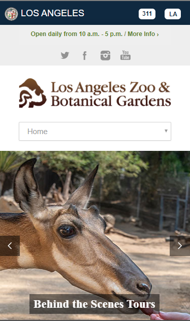
The Los Angles Zoo makes use of visual Hierarchy by popping images and titles at you first, then making your eyes go to clickable links by using contrasting and appealing colors such as the chat button. In the smaller text it tells you when the Zoo is open, thus providing you with subtle information to go and visit as well as the ability to click for more information.
Rule of Thirds
National Geographic
National Geographic shows rule of thirds by presenting text and images spaced out in vertical thirds, going text image and then text, allowing the reader to see the image, read titles, and then read more information in an attractive and eyecatching view.